Drive revenue with the AI-powered DXP that elevates beyond CMS to unify digital experiences, first-party data, & eCommerce
Grow audience with the subscription engine that automates complex fulfillment, circulation audits, & accounting operations
Enable autonomy with AI agent-ready MCP infrastructure to power automated workflows, discovery & content licensing
Engage readers with the only conversational AI search that serves ads, powers sponsorships, & drives subscriptions
Insights & Resources
Strategy, product updates, and real-world case studies from the ePublishing team, written for modern media operators.
After working with a steady stream of publishers to deploy and configure AI assistants on their sites, we’ve learned something...
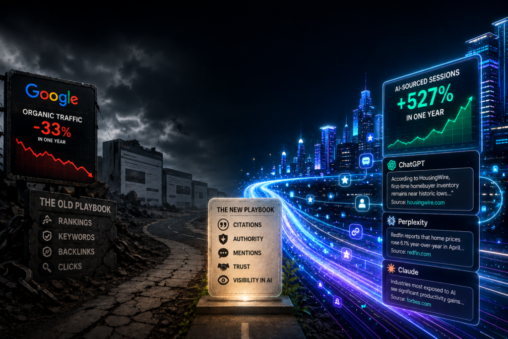
If you’ve noticed your organic traffic acting strangely this year, you’re not imagining it. Your rankings might be holding steady...
Google traffic to publishers dropped 33% in one year. AI-sourced sessions surged 527%. The audience has moved, and the playbook...
This interview was originally published by Fox Associates on May 27, 2026. Read the original article here. Reprinted with permission....
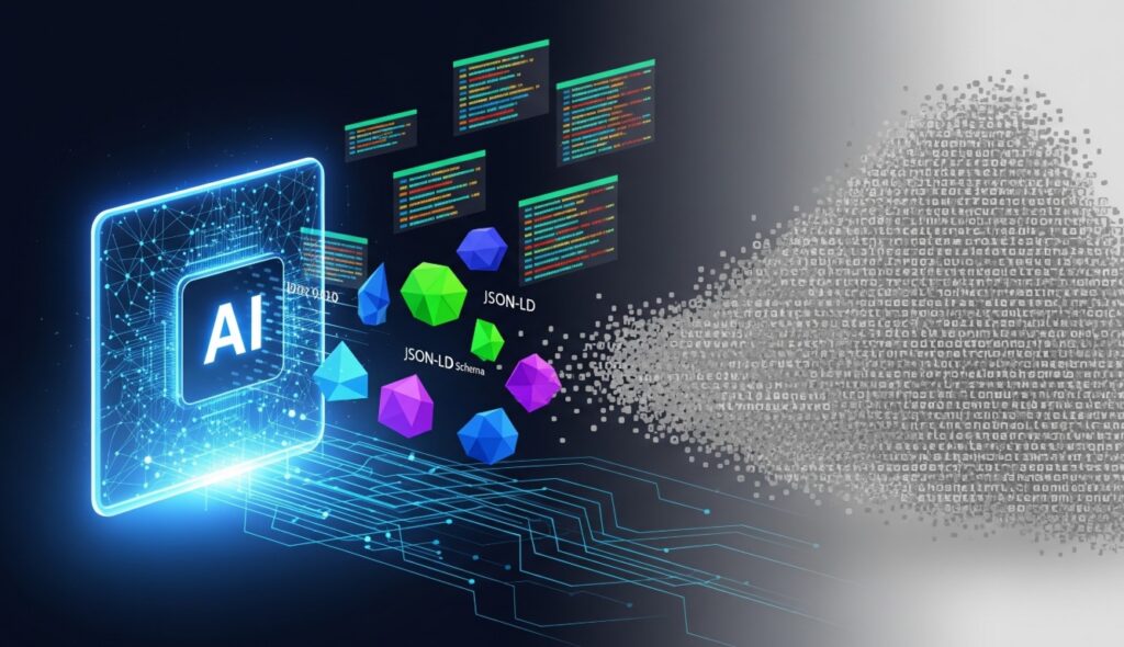
Why structured article data and semantic markup are now the single most important factor in whether your content surfaces in...
We’re excited to share this feature from SIIA, the Software & Information Industry Association, which recently spotlighted ePublishing and how...
I’ve spent the better part of a decade sitting at the intersection of content strategy and product development. I’ve watched...
Every publisher I talk to has the same story. They’ve invested in a powerful CMS. They’ve built out a content...
AI search isn’t just another search bar. It’s an extension of your editorial trust—a way for your audience to access...
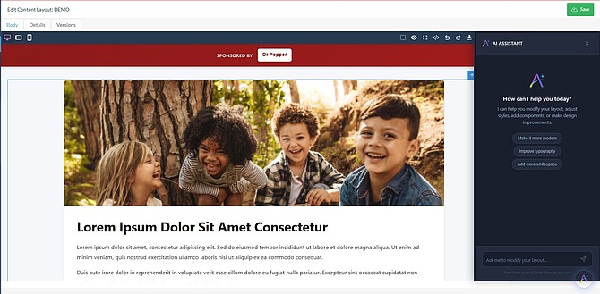
We’re excited to announce this new addition to Continuum. AI Design Engine, a revolutionary visual design tool that empowers you...
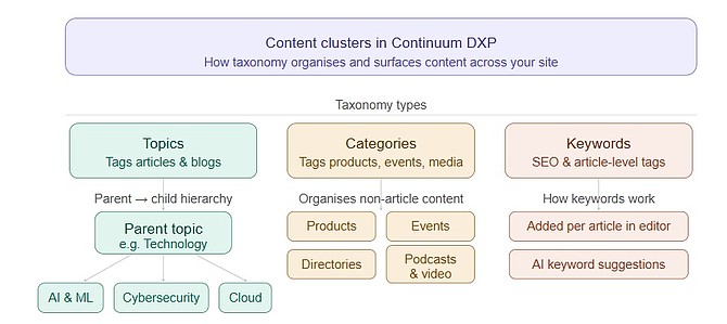
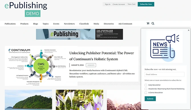
Continuum now provides the capability to configure and display an Editorial Content Area as a pop-up message that allows your...
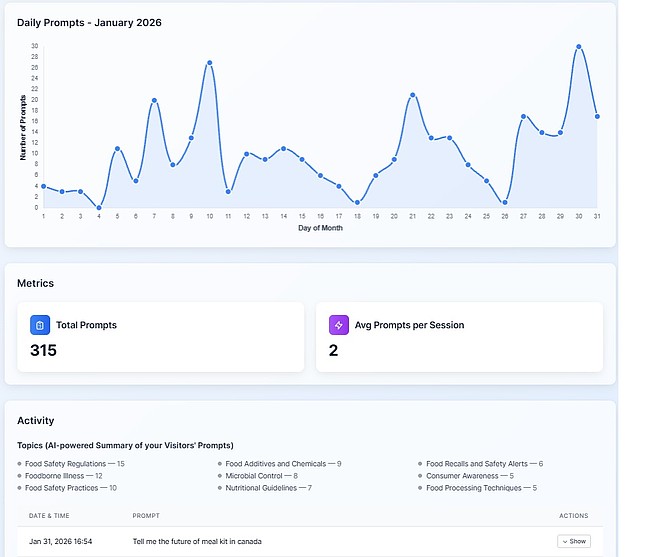
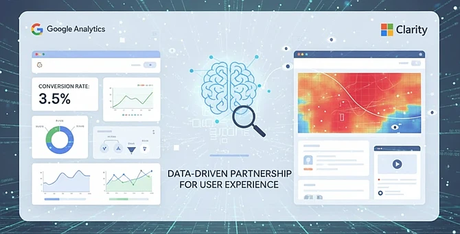
Microsoft Clarity is a free behavioral analytics tool that provides qualitative insights into user behavior through session recordings and heatmaps....